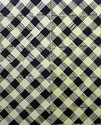
You know those markets you get in European towns and cities? The ones selling cheap fabrics, loads of bad underwear, hardware and brick-a-brack? The clothing you find at them is synthetic, elastic and sheer. Stretchy tops, novelty tights, and leggings. Where designer label logos, motifs and prints have been assumed then skewed, and repeated across a variety of dubious colour combinations.
These small paintings take me there – to those market stalls, at a push to the High Street. To not-at-all-very-sexy underwear, to animal print clothing that might pass were it Roberto Cavalli, but this is mass-produced tat, not designer wear. The pattern shared by all of them tries to be slinky, it teases, it’s tacky. Girls out on a Saturday night.
These paintings are a bit like fabric swatches. And I’m enjoying imagining the clothing made from them, and the people wearing it. I’m enjoying all the ‘bad’ choices – acid greens with magentas, girly pink and peach, or colour which feels like it shimmers off the surface of petrol oil. And the hurry – the hurry of a serial print dashed across a handful of hastily-chosen colour pairings, for a line of clothing you’ll see pile-high and torn-through, and then quickly replaced before the next season.
It’s funny that I go to these associations before thinking about ‘painting’ per se. Because after all they are paintings: stretched and primed canvas, paint. Despite their mechanical appearance, they are very “hand-made”. On close inspection the black pattern undulates into globby pools of paint – thick enough that you could pick the skin off. Katy described to me how she found a piece of upholstery fabric at a large market in Rome, and by covering it in paint, used it to print directly onto the canvasses which had already been washily treated with the checkerboard patterns of colour. The scratches, smudges, and thicker areas of black come from her hands and fingers pressing through the same off-cut, like mono-printing through a textile.
And yet for all of the texture and blobs and gesture and touch, there is some overall sense of remove. I end up not really knowing what I am looking at. I know I am looking at paintings – and I think a bit about the more decorative works of Christopher Wool, or perhaps Josh Smith – but because of a lack of image or any one painting being privileged over another – I feel these works may as well be things, with functions – be it the selections of samples for t-shirts waiting to be produced for a fashion label, or any other fabric design ready to join the circulating mass. They assert themselves in number, but otherwise there is a weird temporality.
I can’t help but think of a market again, specifically Camden Market in London when I look at the two larger paintings. Patched and stitched fat areas of lurid green, pink, blue and purple have been scribbled over with tarry dribbled black – they make me think of the shop Cyberdog there which sells trance music and cyber clothing, and specialises in fluorescent dance wear. You would find these colour combinations there.
I can barely think of a less probable place for Katy to be found shopping than Cyberdog.
If you knew her, you’d know what I mean. When questioned about why these colours, why this kind of ‘taste’, she voices her own surprise at herself. It’s almost in spite of herself that she plucks loud vulgar colour. One almost gets the sense that she wants the paintings to behave in a way that she wouldn’t risk. She could never leave the house in the colours trying to shout out from these two works. And nor could the paintings leave the studio before being “covered up” by a black knitted scrawl.
Text by Sara Knowland


No comments:
Post a Comment